
Student Services Hub
A new approach to accessing university supports.
This redesign aimed to improve the university student services platform by enhancing usability, accessibility, and clarity—ensuring students can easily find and interact with essential support tools
Main Skills Focus : Content Auditing, UX Writing , Information Architecture
Tools : Figma & Miro
Time Frame : 8 week University Coursework
The Problem
“Navigating Student Services shouldn’t feel like a puzzle”
I was tasked with evaluating and redesigning the student services platform and experience. The student services webpage is intended to support students in accessing key resources such as disability services, medical care and educational supports.
However, user research and an accessibility audit revealed several critical pain points.
This created a frustrating experience for students at a time where they needed clear, supportive guidance the most. It also resulted in the valuable services being underutilised.
Information Overload
Important content was buried under repeated or redundant pages.
The site was organised around departments with a vast array of services within each department.
Poor Structure
Several pages did not pass accessibility standards. This is important under the European accessibility act, but also the webpage is a key touchpoint for people to connect to accessibility services and therefore, it is really important that it is easy to navigate for all.
Inaccessibility
Users found it difficult to locate specific information, leading to frustration or giving up entirely. This also resulted in overwhelming the student services in person office with queries.
High Cognitive Load
Research
I began by reviewing the existing student services platform and conducting informal interviews with five students. The goal was to identify common frustrations and understand how users interact with the webpage.
This led to the development of 3 key user personas.
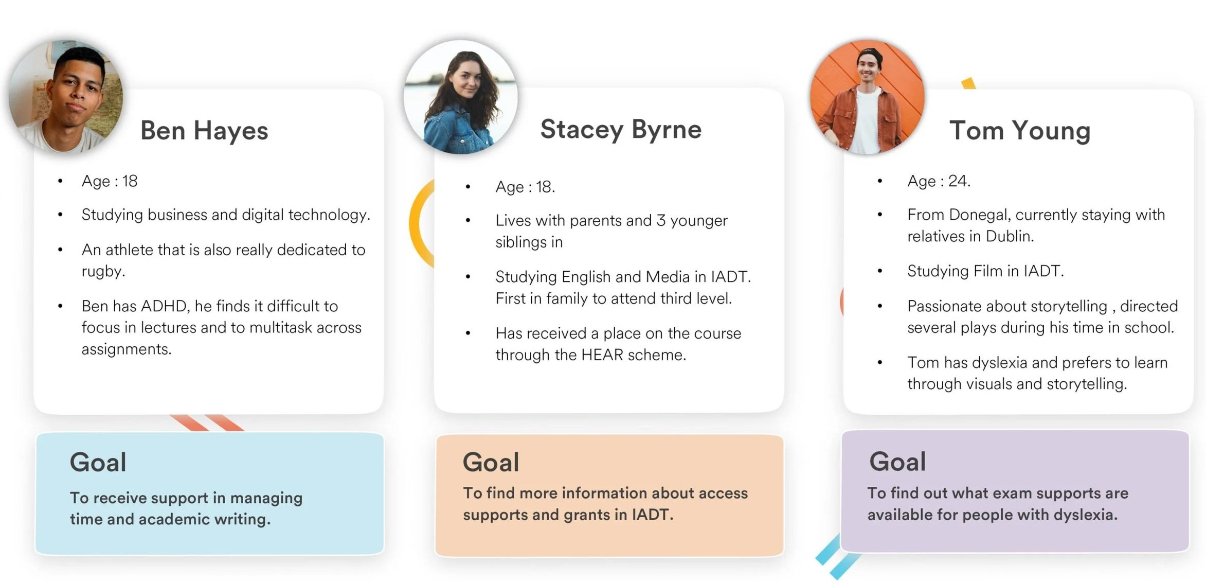
Understanding ADHD
I chose to gather more research on ADHD and build upon the persona of Ben. Through interviews and secondary research I gathered really interesting feedback to feed into the ideation phase. Students with ADHD just have different ways of focusing that is often not aligned with the '“usual” way of learning, this isn’t a bad thing, in fact people with ADHD are more likely to be entrepreneurs; with more creative approaches to tasks [Think Richard Branson , Bill Gates , Walt Disney]. I wanted to design for different approaches to focus and to make the student experience webpage more enjoyable to use.

Current User Journey
I performed a usability test on the current student services webpage with 2 seperate participants. Below is an overview of comments made throughout.

Project Definition
It was important to define the project goals to ensure that the user was at the centre of the design process as it moved forward.
“When I am looking for information on student services, I want it to be fun, easy to find information and personalised to my needs so that I can save time and feel more involved in IADT life and the services it offers”

Design a student service experience that is;
Enjoyable to use.
Feels personalised to the user.
Considers different types of focus.
Is clear, concise and offers reassurance.
Aligns with the principles of universal design.
Project Goals
Benchmarking
Research into existing products helped to align the ideation phase with the project goals. I looked at apps that had elements of fun and personalisation.
Microsofts inclusive design principles highlighted the importance of considering different types of focus. I looked at physical products such as fidget toys and how this engaging activity can better help people to focus on tasks.

Prototypes and Testing
I created paper prototypes and tested basic user flows. I wanted to discover what types of interactions were more engaging. I was inspired by apps like Tik Tok and dating apps that keep user engagement through various types of scrolls.
This small-scale testing showed that there was no clear favourite in terms of the presentation of services. This was an opportunity to link back to universal design and add a button that allowed the user to switch views or simply search for topics.


Student Services Hub
The student services hub is a community for students to access personalised support and information. The project highlighted the importance of creating fun and interactive experiences that students will want to use, whilst also providing clear actionable information.

UX Writing : Tone of Voice Considerations
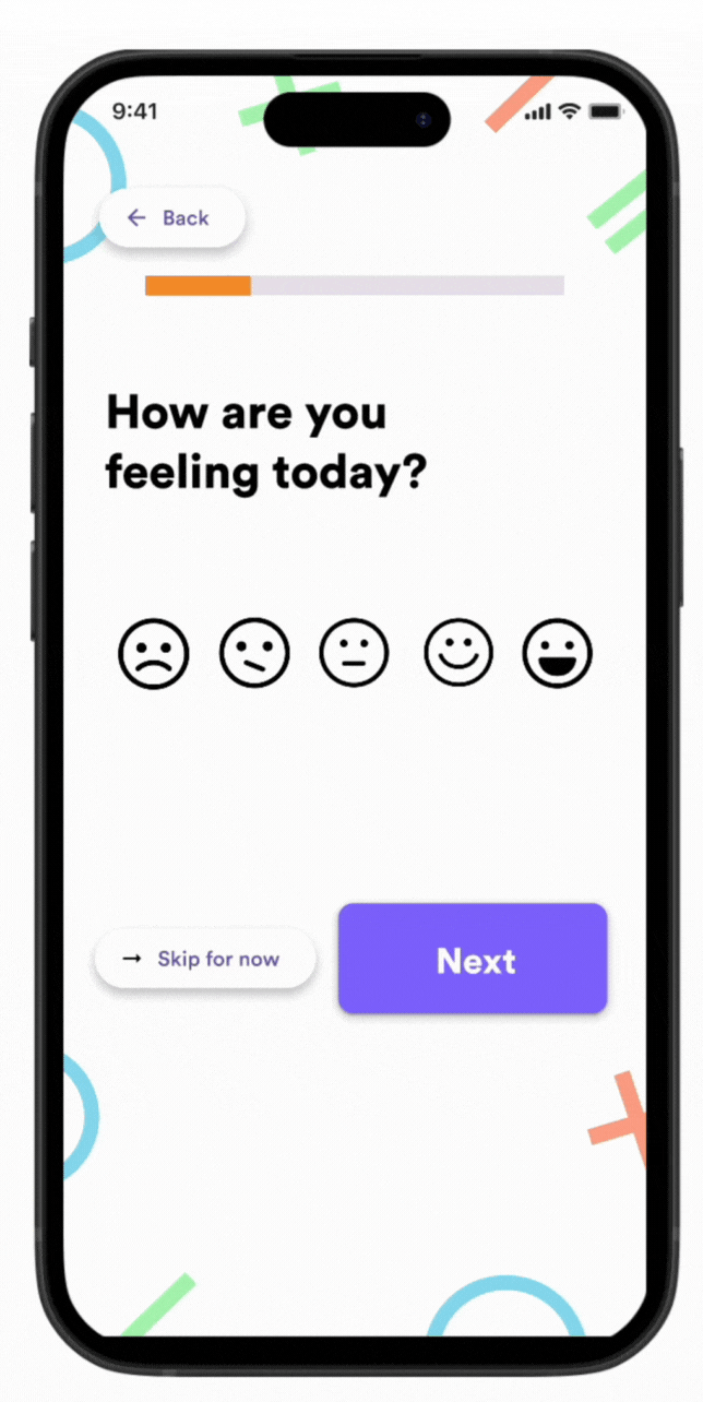
The original platform offered no onboarding, leaving students to navigate a dense list of services with little context or support. This often resulted in confusion and drop-offs.
To improve first-time experiences, I introduced a light onboarding flow paired with human, friendly microcopy to guide users and reduce friction.
Key Enhancements:
A warm welcome message that sets a supportive, student-focused tone
Onboarding questions that help personalise the experience and surface relevant services
Conversational, jargon-free language that brings a sense of ease and approachability
Subtle use of tone and content to add a touch of personality and fun — helping the platform feel more like a guide than a form
These improvements not only help users feel more confident from the start, but also allow the system to offer smarter service suggestions over time, tailored to each student's goals or needs.

Personalisation Through Onboarding
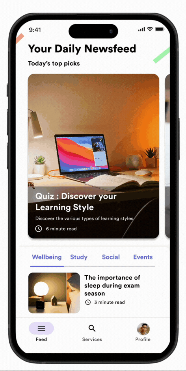
Profile Creation and Daily Newsfeed

Testing & Impact
I completed a small user testing session with 8 IADT students (mix of years 1-4, including 2 students with ADHD).
Compared to current student services webpage:
Task completion time reduced by 58% (4min → 1min 40sec average)
100% of participants found relevant services on first attempt (vs 50% with current site)
Personalised onboarding reduced "I don't know where to start" confusion reported by all users in initial research
"This feels like it's actually designed for students" - direct quote from testing
The toggle between list/grid view was used by 6/8 participants, validating the hypothesis that different cognitive styles need different information architectures.
Reflection
This project allowed me to take a complex, service-heavy experience and rethink it from a student’s perspective. The work sharpened my skills in designing for clarity, accessibility, and tone — and highlighted how thoughtful microcopy and onboarding can make large systems feel human.
What I have learned:
The importance of reducing friction through clear, welcoming language
How visual hierarchy and content strategy work together to simplify navigation
That even small improvements (like onboarding or tone) can have a big impact on engagement.